If you are looking for branding & logo design in Toronto contact Mark Haak at Swerve!
Our Branding and Logo Design Process
To initiate all branding and logo design projects we start with a Discovery & Planning session. We'll gather information and ask questions to learn about your audience, expectations, uses and goals. And we'll do a brand audit (if any existing branding exists), competitive analysis and review of your primary messaging. We’ll present creative directions for imagery, colour and fonts to make sure the direction we start with will be as on target as possible.
A Few Logo and Branding Rules
Every logo design project is unique, but we try to keep in mind a few general rules as we work.
The Size Doesn’t Matter Rule.
Your logo must work equally well at the smallest size as it does in the bigger applications. A benchmark is if you can read your logo on the side of a pen you’ve got this rule covered.
The Black and White Rule.
Most logos will at some point be used in applications that reduce your options to either black or white: photocopiers, black and white advertising, single colour printing. If your logo depends on colour to work, then your logo doesn’t work.
The Is It Appropriate Rule.
A logo needs to be appropriate to the company. If it is a law firm, it should look like a law firm. If it is organic coffee, then it should look like organic coffee. We’re not saying that the logo has to be an illustration of the business, just that it should represent the mood or feeling of the industry and company.
Conceptual Development
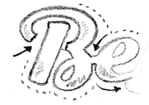
After we know our target and goals, we can brainstorm directions and begin to explore creative concepts for icon and wordmark. Colours, fonts and appropriate visuals are explored. Typically we have multiple designers and illustrators working on concepts so we get a wide range of creative possibilities. Often we'll sketch 10 - 30 concepts and pick the best to start to develop on the computer.
Computer Sketching
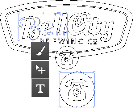
The best sketches are selected and we begin to illustrate them on the computer. Colours and fonts are explored. Legibility is top of mind with all the end uses to ensure the directions we are going in will work for final concepts.
Further Exploration
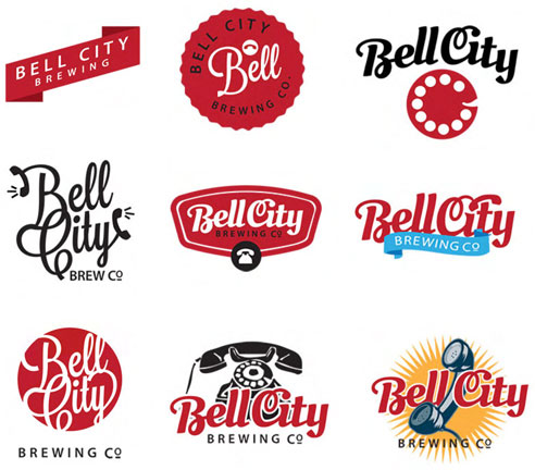
Often we'll develop 5-10 concepts on the computer, do internal reviews with all our designers to provide input and make recommendations for improvements. Font and colour palettes are explored and selected.
Concept Selection
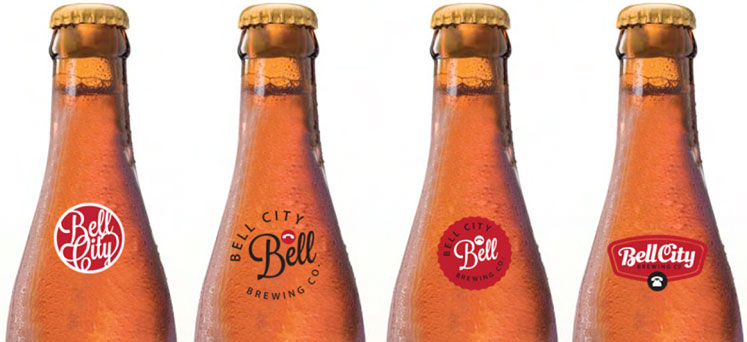
After critiquing all the logo concepts, we compare them to the creative brief we made in step one because we want to ensure all concepts are on target. The best concepts are selected to show the client, usually about 3 or so designs. Concepts are finalize and prepared them for presentation, often mocking them up in real world scenarios like business cards and website headers so you can see them in context.
Logo Selection
Once the logo has been selected, we incorporate any last tweaks and finalize the colours and create alternate versions including black and white, reversed out, because we need to know what it looks like on a dark background. All the final mechanical files are built. The final logo is output in multiple formats, including the original source vector .eps file as well as .jpg or png versions so you can use in Word or other applications.
Logo Usage Manual
For some projects we'll put together a logo usage guide book that lists all the fonts, Pantone and CMYK colours and general application usage rules for positioning as well as things to avoid.
Building the Brand
Beyond just the logo design we often build additional branding materials including business card design, stationery, presentations, websites, product designs and more.
