Web design seems to change daily and it can be hard to keep up with all the new technologies out there. One of the more recent advancements that you should be aware of is a thing called responsive design.
Before Responsive Design
Until recently you only needed to worry about how your site looked on large desktop screens or smaller laptop computer screens. Now with the mass use of tiny screens on mobile devices such as smart phones and tablets you need to know how your site looks at this new, at times tiny, size.
Does the site just reduce to be too small? Are viewers able to read your content? Can they interact with the menus on screen?
Responsive design automatically resizes, moves and reformats elements as needed to fit the many different sized screens. Think of your site now being held together with rubber bands – everything can move and reshape as required.
Often this may mean rethinking content completely if viewed from a small smart phone. While the full, large screen view of your site can include everything and the kitchen sink, the view on a small screen may require you to edit what information is displayed, even to the point of dropping less important items that just can’t fit in such a small space.
Examples of Responsive Design
Visit sites such as the Boston Globe, Toronto Star, etc on your smart phone and see how it looks different and is optimized for mobile viewing.

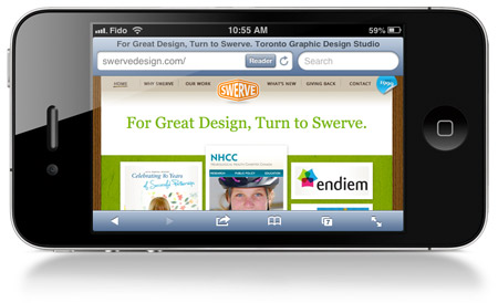
Above is what the Swerve site looked like on an iPhone before responsive design was applied. Note how small the navigation across the top is – so small you almost can’t use it.
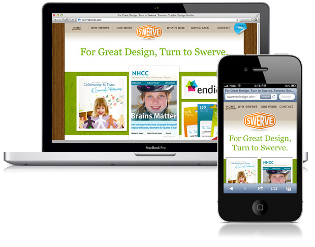
We’ve rebuilt the Swerve site using responsive styles.

As you can see, the two samples have the same design but the smaller iPhone view drops some of the top navigation and reduces number of featured images on the home page. The navigation also uses a larger font size in the css style sheet. The goal is to make it as easy as possible for someone on a smart phone to interact with our site. For us, this means viewing our portfolio and then getting our contact information.
When thinking about your site, you need to consider what the most important items are, and feature them first. Lower tiered items may need to be reduced or dropped altogether.
Contact us to discuss how we can revise your site to work on all devices.
