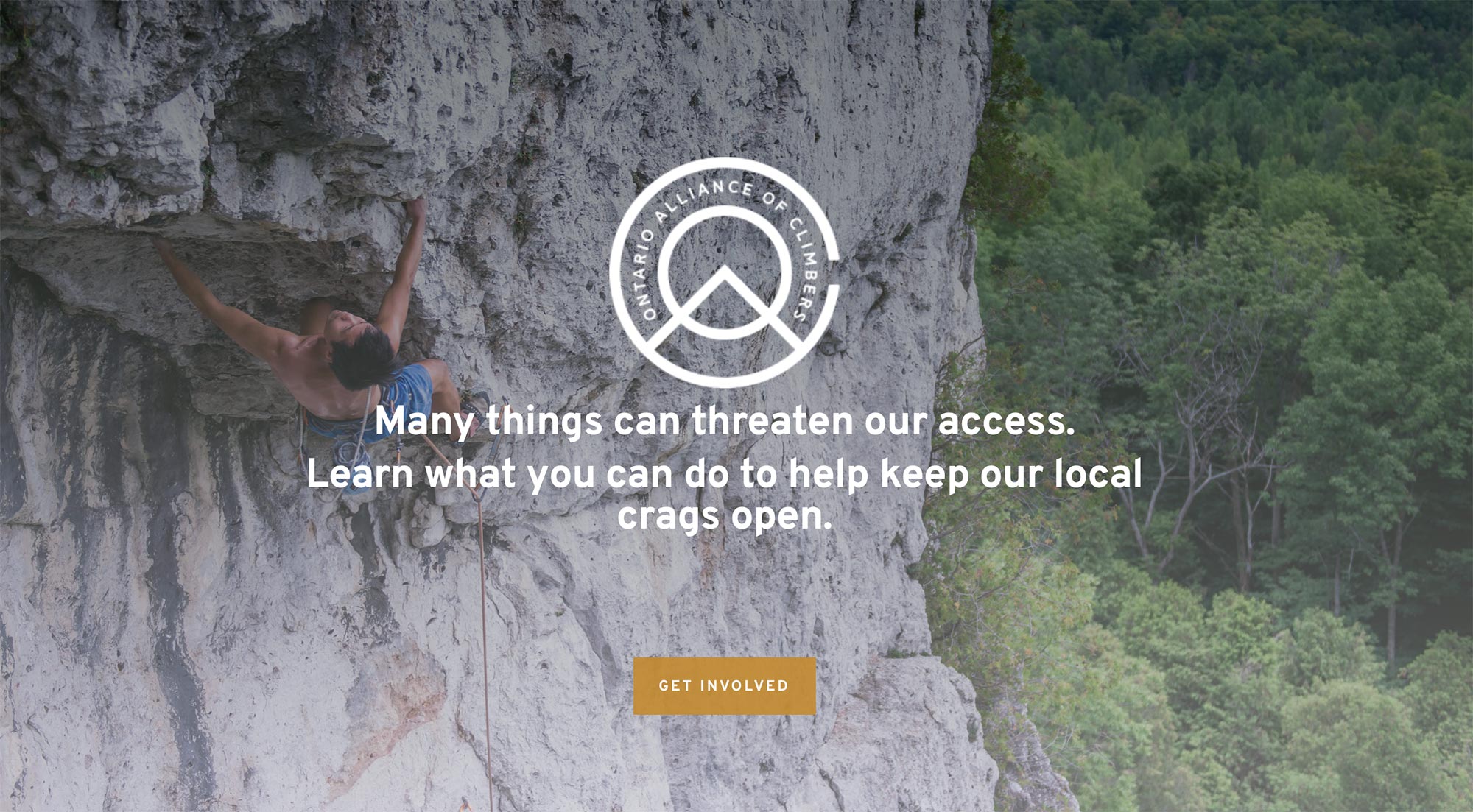
![]() The Ontario Access Coalition renamed themselves the Ontario Alliance of Climbers to better reflect their members who are all climbing related outdoor enthusiasts. We helped them rebrand with a new logo design that better reflects their mission and members.
The Ontario Access Coalition renamed themselves the Ontario Alliance of Climbers to better reflect their members who are all climbing related outdoor enthusiasts. We helped them rebrand with a new logo design that better reflects their mission and members.
Their new logo is iconic and simple so easy to use on promotional materials and merchandise. It also tells a story – the acronym OAC is used in an interesting way with the circle (the O) in the middle representing complete, and inclusion and forming a rising sun as well as the covered peak of the mountain. The A intersects the O to give it the A shape all the while resembling the mountain face. The outer C ties it all together and the opening of the C represents access to the mountain which is really what the organization is all about – providing access to climbing spaces.