Peninsula Family Service’s brand was well established in their San Mateo, California city but they had ongoing issues with the old identity. It didn’t work well when reversed out (printed on dark background) and the hand in the icon was white which didn’t represent the diversity of their community.
They tasked us a unique challenge to update their logo to be more diverse and user friendly, while introducing their new tagline “Opening Doors, Changing Lives” while maintaining the brand recognition of their old logo.
This was no small challenge but we successfully created an evolved logo that was more of an evolution than a revolution and achieved the objectives outlined.
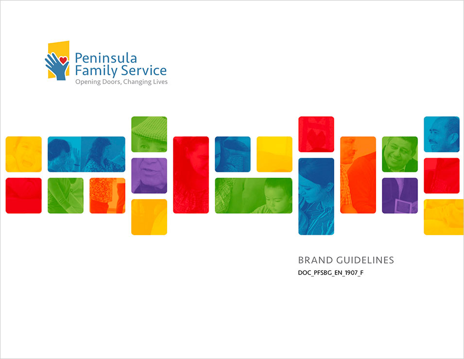
We paired this up with a new brand guideline to help them tell their story and maintain consistent communications. We wrote new messages and program overviews and defined how they use their brand and communicate their messages.


