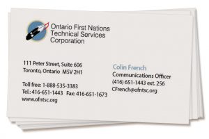
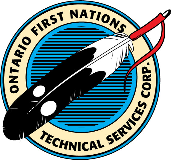
We updated the logo design for Ontario First Nations Technical Services Corp by evolving their existing icon into something more modern and easier to use. We decided to take a more evolutionary rather than revolutionary approach to maintain their brand equity in their existing logo which was well known to their clients and industry.

Along with redesigning their logo we showed them how it would work on their stationery, brochures and website.


The new logo is a big improvement on the old version, but still keeps a similar look and feel. The old logo did not reproduce well at small sizes, was hard to read and created issues with the line pattern in the background.
 Old OFNTSC logo shown.
See more of Swerve’s branding work here.
